Page 1 of 1

The Worst Designs - Discussion Thread

PostPosted: Sun Jan 23, 2022 5:41 am
by AllNewSuperRobot
In the 30+ years of the Transformers, some of the characters created have truly iconic and enduring designs, that have defined decades of aesthetic. Some...

Image

Not. So. Much.

While I'll try to remain objective. Being an arty-farty type, with little in the way of bias where possible. I thought it might be a good idea to sound off on the unfortunate. Not those you hate but those that just don't work, in your opinion. Plus, what you think could be done to improve them?

I'll start with what I think is one of the absolute worst in G1...

Image

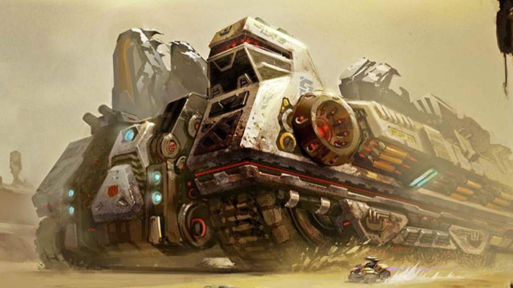
Menasor. Now I like the idea of the Stunticons. A team of racing vehicles is quite unique and novel among the Decepticon ranks. But the end result is one truly ugly Gestalt. Lacking in every department. From uniformity of colour, to symmetry of design. Even modern iterations end up the same. Bland and boring is the result..

Image

So what would I change? I look to Bruticus in the WFC/FoC games. IDW did come up with something similar back in "Things Fall Apart" in 2010:

Image

While a Cybertronian-type aesthetic would add some much needed detail. It only goes so far before being gated by the elephant in the room. A serious overhaul would be needed. Either add colour to Motormaster or change how Menasor is formed. Maybe with Motormaster as the legs (inverted, as a blend of silver with black) and the others forming the rest of the body?

Re: The Worst Designs - Discussion Thread

PostPosted: Sun Jan 23, 2022 2:48 pm
by Rodimus Prime
I wouldn't say Menasor is the worst, the limb bots are just fine. It's Motormaster's torso mode that completely ruins it in CW.

If we're talking overall design, lack of uniformity in color can be applied to a lot of them. Devastator is pretty much the only one that actually looks like 1 single bot after combination. I do agree though, I also would like to see all members of a gestalt team the same color.

Re: The Worst Designs - Discussion Thread

PostPosted: Mon Jan 24, 2022 1:34 am
by Burn
Rodimus Prime wrote:I wouldn't say Menasor is the worst, the limb bots are just fine. It's Motormaster's torso mode that completely ruins it in CW.

And the feet. Those hand/feet pieces, while I like the idea of them, the execution was just terrible. They were just too small.

Re: The Worst Designs - Discussion Thread

PostPosted: Tue Jan 25, 2022 3:12 pm
by AllNewSuperRobot
To me, while most other combiner teams do blend together, to a certain extent. Menasor is like a base black body with cars stuck on his arms and shins. It just doesn't look integrated enough for a Gestalt.

Re: The Worst Designs - Discussion Thread

PostPosted: Tue Jan 25, 2022 7:01 pm
by Rodimus Prime
Burn wrote:
Rodimus Prime wrote:I wouldn't say Menasor is the worst, the limb bots are just fine. It's Motormaster's torso mode that completely ruins it in CW.

And the feet. Those hand/feet pieces, while I like the idea of them, the execution was just terrible. They were just too small.
Absolutely. They should have thought it through better. But I guess that was the most cost effective way. They made hands and feet for Computron, Victorion and the Japanese releases though. But I guess that's Takara, who don't mind bumping up the prices a bit for a higher quality product.

Re: The Worst Designs - Discussion Thread

PostPosted: Wed Jan 26, 2022 7:58 am
by MaximalNui
Rodimus Prime wrote:
Burn wrote:
Rodimus Prime wrote:I wouldn't say Menasor is the worst, the limb bots are just fine. It's Motormaster's torso mode that completely ruins it in CW.

And the feet. Those hand/feet pieces, while I like the idea of them, the execution was just terrible. They were just too small.
Absolutely. They should have thought it through better. But I guess that was the most cost effective way. They made hands and feet for Computron, Victorion and the Japanese releases though. But I guess that's Takara, who don't mind bumping up the prices a bit for a higher quality product.

I personally feel the opposite: those pieces are fine as feet, but as hands they look too big and ape-ish. That sort of look fits the more brutish Devastator, but for some reason I don't think it fits Scramble-type combiners at all. I feel they should be closer to the head in size, maybe only slightly bigger to look stronger.

Anyway, I think the worst of all is BM Nightscream. I'll usually defend the series, and am a lot more open to alien-looking designs, but he's just awkward in both toy and cartoon form. And who on their right mind though hair would look good in a robot, especially when your current animation technology makes it look like a lump of flesh?!

Re: The Worst Designs - Discussion Thread

PostPosted: Thu Jan 27, 2022 6:28 pm
by Rodimus Prime
MaximalNui wrote:
Rodimus Prime wrote:
Burn wrote:
Rodimus Prime wrote:I wouldn't say Menasor is the worst, the limb bots are just fine. It's Motormaster's torso mode that completely ruins it in CW.

And the feet. Those hand/feet pieces, while I like the idea of them, the execution was just terrible. They were just too small.
Absolutely. They should have thought it through better. But I guess that was the most cost effective way. They made hands and feet for Computron, Victorion and the Japanese releases though. But I guess that's Takara, who don't mind bumping up the prices a bit for a higher quality product.

I personally feel the opposite: those pieces are fine as feet, but as hands they look too big and ape-ish. That sort of look fits the more brutish Devastator, but for some reason I don't think it fits Scramble-type combiners at all. I feel they should be closer to the head in size, maybe only slightly bigger to look stronger.
Well to each our own, to me they were acceptable has hands only and too small and inarticulate as feet. They didn't support the weight of the combiner and also limited poseability.

Re: The Worst Designs - Discussion Thread

PostPosted: Mon Feb 07, 2022 10:49 am
by Evil Eye
Menasor is a funny one. The G1 toy was all things considered pretty handsome, if horrendously out of scale. The cartoon model however is an abomination before Primus and the fact the new one is supposedly going that route, with cars slapped on a skeleton, bothers me to no end.

As far as CW Menasor goes, it's weird. Limbs are fine and Motormaster is a decent individual but boy does he SUCK as a torso (with the upgrade pack he at least looks much better though). Really I'd be happy with a better Motormaster to pair up with the original limbs.

My personal favourite Menasor design is probably the RID2015 design...which is why I'm sad it'll never get a good toy.

Re: The Worst Designs - Discussion Thread

PostPosted: Fri Feb 11, 2022 4:24 pm
by MaximalNui
Rodimus Prime wrote:If we're talking overall design, lack of uniformity in color can be applied to a lot of them. Devastator is pretty much the only one that actually looks like 1 single bot after combination. I do agree though, I also would like to see all members of a gestalt team the same color.


What about Predaking? The G1 Predacons also had quite an uniform color scheme between the whole team, if I remember...

Also, I can't believe I forgot to mention the greatest example of "quantity isn't quality" for gimmicks:

Image

Armada Side Swipe!

Even the Mini-Con looks weird.

Image

Re: The Worst Designs - Discussion Thread

PostPosted: Fri Feb 11, 2022 10:06 pm
by Rodimus Prime
MaximalNui wrote:What about Predaking? The G1 Predacons also had quite an uniform color scheme between the whole team, if I remember.
For me, he's borderline, I guess. The Preds are more or less uniform, but they do have deviations in deco. When I cited Devy, I meant completely uniform. They're all green, with very small parts of purple sprinkled in. AFAIK no other gestalt has that.

Re: The Worst Designs - Discussion Thread

PostPosted: Sat Feb 12, 2022 4:19 pm
by Jelze Bunnycat
Rodimus Prime wrote:
MaximalNui wrote:What about Predaking? The G1 Predacons also had quite an uniform color scheme between the whole team, if I remember.
For me, he's borderline, I guess. The Preds are more or less uniform, but they do have deviations in deco. When I cited Devy, I meant completely uniform. They're all green, with very small parts of purple sprinkled in. AFAIK no other gestalt has that.


Volcanicus, mostly silver with gold and red accents... then there's Swoop as the blue arm :lol:

Re: The Worst Designs - Discussion Thread

PostPosted: Fri Feb 18, 2022 7:07 am
by Evil Eye
Jelze Bunnycat wrote:
Rodimus Prime wrote:
MaximalNui wrote:What about Predaking? The G1 Predacons also had quite an uniform color scheme between the whole team, if I remember.
For me, he's borderline, I guess. The Preds are more or less uniform, but they do have deviations in deco. When I cited Devy, I meant completely uniform. They're all green, with very small parts of purple sprinkled in. AFAIK no other gestalt has that.


Volcanicus, mostly silver with gold and red accents... then there's Swoop as the blue arm :lol:

I won't lie I actually quite like the slightly differently-coloured arm (or leg depending on configuration but it works better for an arm); gives me serious "This hand of mine is burning red blue! It tells me to seize victory!" vibes.

Re: The Worst Designs - Discussion Thread

PostPosted: Sat May 28, 2022 1:57 pm
by AllNewSuperRobot
Sorry. It occurs to me, when first discussing Menasor. I noted it as being the worst design in G1. That was clearly missing a clarifying descriptive.

The worst Gestalt design in G1.

So, with that out of the way. Let's talk about Broadside...

Image

Bless Dreamwave for giving possibly the only decent image of the unfortunate Triple Changer. Otherwise...

He just...
Image
...doesn't...
Image

Image Image

...Work!

Also kudos to High Moon studios, ala Fall of Cybertron for trying to address the elephant in the room:

Image
Image

In concept, Broadside works. But, as we've all discussed many times, the scale is all wrong. Not even scaling in terms of his contemporaries. But as a Triple Changer. Most iterations, the "jet" (being charitable with the description) is the weakest link. But the Bot Mode normally isn't much better. When your best mode is essentially a flat topped ship. A bit more time in the design room was probably needed.

Re: The Worst Designs - Discussion Thread

PostPosted: Sat May 28, 2022 2:03 pm
by RodimusPrimeUkraine1
AllNewSuperRobot wrote:
So, with that out of the way. Let's talk about Broadside...

Image

Bless Dreamwave for giving possibly the only decent image of the unfortunate Triple Changer. Otherwise...

He just...
Image
...doesn't...
Image

Image Image

Well yes, the scale is terrible, Broadside transforms into his own carrier. :michaelbay:
But it could be slightly better if he turns into a boat and a small jet or a giant bomber and a carrier
...Work!

Also kudos to High Moon studios, ala Fall of Cybertron for trying to address the elephant in the room:

Image
Image

In concept, Broadside works. But, as we've all discussed many times, the scale is all wrong. Not even scaling in terms of his contemporaries. But as a Triple Changer. Most iterations, the "jet" (being charitable with the description) is the weakest link. But the Bot Mode normally isn't much better. When your best mode is essentially a flat topped ship. A bit more time in the design room was probably needed.

Re: The Worst Designs - Discussion Thread

PostPosted: Sun May 29, 2022 4:35 am
by AllNewSuperRobot
RodimusPrimeUkraine1 wrote:Well yes, the scale is terrible, Broadside transforms into his own carrier. :michaelbay:
But it could be slightly better if he turns into a boat and a small jet or a giant bomber and a carrier


Without altering his altmodes. Broadside (as alluded to by High Moon) could have worked as a Titan. As a City Bot, unlike Metroplex and Fort Max, with three distinct modes. More mass would have led to a jet that actually looks like it could fly and a carrier that can actually carry other bots. Also there would even be redeco potential (Modulator-style) with the Micromasters, Flattop/Skywave:

Image

Re: The Worst Designs - Discussion Thread

PostPosted: Mon May 30, 2022 10:14 am
by RodimusPrimeUkraine1
AllNewSuperRobot wrote:
RodimusPrimeUkraine1 wrote:Well yes, the scale is terrible, Broadside transforms into his own carrier. :michaelbay:
But it could be slightly better if he turns into a boat and a small jet or a giant bomber and a carrier


Without altering his altmodes. Broadside (as alluded to by High Moon) could have worked as a Titan. As a City Bot, unlike Metroplex and Fort Max, with three distinct modes. More mass would have led to a jet that actually looks like it could fly and a carrier that can actually carry other bots. Also there would even be redeco potential (Modulator-style) with the Micromasters, Flattop/Skywave:

Image


Yes, I thought of titan class, definitely would work for him!

Re: The Worst Designs - Discussion Thread

PostPosted: Mon May 30, 2022 10:19 am
by Evil Eye
I think one worth mentioning independent of Menasor (who has already been mentioned) is Dragstrip. His cartoon model is just straight-up a cheese man. I actually liked the CW one adding that burgundy/wine red colour for some breakup.

Re: The Worst Designs - Discussion Thread

PostPosted: Mon Jan 30, 2023 4:13 pm
by RodimusPrimeUkraine1
Evil Eye wrote:I think one worth mentioning independent of Menasor (who has already been mentioned) is Dragstrip. His cartoon model is just straight-up a cheese man. I actually liked the CW one adding that burgundy/wine red colour for some breakup.


I think grey upper legs and mid arms would work better for him.

Re: The Worst Designs - Discussion Thread

PostPosted: Mon Jan 30, 2023 6:45 pm
by D-Maximal_Primal
Might be an unpopular one here, but I think most of the G1 cartoon models were pretty fugly. But most egregious include cartoon Kup, Skids, and any of the Stunticons/Menasor.
MaximalNui wrote:
Rodimus Prime wrote:If we're talking overall design, lack of uniformity in color can be applied to a lot of them. Devastator is pretty much the only one that actually looks like 1 single bot after combination. I do agree though, I also would like to see all members of a gestalt team the same color.


What about Predaking? The G1 Predacons also had quite an uniform color scheme between the whole team, if I remember...

Also, I can't believe I forgot to mention the greatest example of "quantity isn't quality" for gimmicks:

Image

Armada Side Swipe!

Even the Mini-Con looks weird.

Image

This is probably the main correct answer though.

Re: The Worst Designs - Discussion Thread

PostPosted: Tue Jan 31, 2023 4:16 pm
by RodimusPrimeUkraine1
"Fixed it LOL" (See: Legacy line discussion)
Image